Creating a game ready character: Tokoloshe
- Thivolan

- Mar 22
- 14 min read
Updated: Apr 19

In this article ill go through a quick overview of the process, some tips and tricks and just a general overview of the journey to create this original character... Oh Yeah, im also working through the videos which basically showcase the whole process without commentary; ill post them here as i publish them!
content:
Inspiration & Initial Designs
Tokoloshe (toh-koh-loh-shee) - a malevolent, imp-like spirit from Zulu or Xhosa culture. According to belief, Tokoloshes are summoned by people wishing to do harm to others. The Tokoloshe is capable of causing illness and death to the victim and can shapeshift; i used this to really drive the malicious look of the creature which i think came through pretty well. I also used the idea of shapeshifting in the model which we will go through a little later...
According to popular legend, people raise their beds on bricks to prevent the tokoloshe from getting to their feet. There are many types of tokoloshe but they are usually long-eared goblin-imp-like creatures that feed off the energy of negative actions. They are also always connected to a witch who uses them to carry out nefarious deeds - I also used these elements to drive some of the designs esp the head being chopped off to show that the actions of a tokoloshe aren’t carried out by something capable of reason…
Also tokoloshes dont really have any predetermined looks other than being small, malicious and imp like so i did have quite a bit of freedom (Maybe too much!!!) with the designs and choices.
Initial Designs:
Oh, BTW, the brief was to create a myth reimagined in the future (Basically a cyberpunk myth) so here i chose to recreate the tokoloshe in a cyberpunk type setting...
Here i start off with some really quick, really trash designs... When you first start off these designs arent going to look amazing. BUT!!! it improves as you go and as you steal - i mean use other artists works for reference. Refs are important here, DO NOT neglect the use of them!!; unless you are really advanced or unbelievably overconfident (and ignorant) you wont really need to use them as much...


Given that im going to actually sculpt this i dont take the designs too far as i will also design the model as i go in 3d... Remember that i used plenty of refs to get here so it really does take a second before you calibrate what you are drawing to what you want to see/ want to make!
Speaking of 3d...
Starting the sculpt
So here ill start on a quick base of what i think the model should look like and the direction I want to start going in; it is NOT FINAL and this is the point, just like with the 2d phase; we're just getting something down for now, something to work from.


At this point ill try to make the model look "Cooler" by using design elements like 80/ 20, hard vs soft, composition rules, colour variation etc. Im not strictly doing a checklist here but using what ive learnt from design to slowly intuit and feel my way through the design; this comes from a ton of failed attempts and designs, unfortunately...


Refining the Design
The design is starting to form something here, so up next ill really try to clean up and tie the designs together as currently things look too disjointed and random...


This is pretty much the final design! There are a few things i wanted to resolve better like the belt and chest areas but i just wasnt sure if i would have made the deadline so i pushed onto retopo Instead!
You'll also notice that i used pieces to join the arms to the torso so it looks like cables connecting! Ive done this in a few places... The connection/ transition of things in any piece (how environments transition from hot to cold, how a mech arm transitions to skin) is always super important so dont leave it out! This element is often forgotten and can be jarring if not handled properly...
Another important element is the repetition of pieces throughout to bring the model/ piece together; you cant have a bunch of random pieces that have no clear connection, i have material, metal, skin and colours that echoe throughout the design; I'm not saying ive done the best job but i think its not too bad of a try on my side to try and bring elements together to look like they belong!


Simplification is key!!
Whenever my designs get lost or start to become too complex i will simplify them down in photoshop with colours and shapes; this helps me tremendously - to see what needed grouping, elimination etc...

This is way more helpful than the sculpts i did to try and figure stuff out! The shapes, colours and forms are simple and easy to read. This took maybe 5 minutes to do but it will save hours when you get stuck and are trying to design things quickly!
Things i would have changed:
In case youre wondering what i would have changed and why, heres a quick breakdown:
1.) Better Variation with the hardsurface chest piece:
Even though its a hardsurface piece it doesnt mean we cant add variation! Youll see that i added variation to other parts but kind of left out the areas i indicated... Varying things up creates more interest, breakup and a better overall design; you can also use harder/ softer edges to guide the eye like i did with the bottom plate. Harder edges draw more attention while softer edges will move the attention away like focus on a camera...
2.) Better transitions between certain areas.
Like i explained above, transitions between areas should be properly considered and applied...
3.) Better ways to group the center belt area
This area looks slightly out of place and it also kinda looks too similar to the chest center piece; repetition is great but too much and too similar can be dangerous


Retopology
Okay, so its time to stop being lazy and start to actually write this part! Dammit!
Lets go through why we actually retopo and given that theres plenty of videos and articles that already explain how to retopo stuff ill just do a quick walkthrough here instead of something over-the-top...
Why retopo?
The whole point of retopo is to create a mesh that keeps the shape of the original mesh with less polygons for use in gaming, cinema etc.
Retopoly willl be based off of how the model will work in engine; is it going animate? will we see it up close? are we just using it standing still? These questions will determine how you should retpo the model and also a budget for the polygon count; more polys and skeleton animation points will create a heavier model so these are important to evaluate beforeahnd... Also retopo doesnt deal with story/ composition; its a purely scientific process. When you retopo look at it through the eyes of an engineer or scientist not an artist! It doesnt have to be perfect only work for its intender purpose(s)
Points to consider:
What is the model doing in engine; animated models need more specific topology while models that dont bend or stretch need less thought out polygons...
What is the budget for this mesh? Poly counts add up and we usually dont want too heavy of a file...
If its going animate, where are the joints, stretch, rotate points etc? We usually dont want to place triangles on these points as they will deform and move in odd ways...
WIP, more to come for this part!!!
Texturing
For this part i wont be covering everything texturing related but i will go through some tips and also how i vary up the materials for better breakup and more realistic results! Ill mainly go through the metal, blood and maybe the fabric/ skin. So, lets get started.
your materials need to tell a story; use variation and breakup...
As the heading states, breakup and variation will take your materials a long way, this applies to height, roughness and colour. You want to use all of these things to tell a story. And thats probably the most important goal of texturing; to enhance or better tell a story ... Older doors should look older, metal doors should look metal, Shoes that are constantly used shouldnt look brand new etc.
Speaking of telling a story: One of the problems i had with the Outer Worlds 2 was the fact that almost every asset looked brand new, like factory new. This is fine if thats what you want but not every building in a game can look brand new; its just kinda jarring... Compare that to the look of resident evil 7 and the difference is immediately felt. RE7 showcases a desolate, not very well kept, dilapidated house perfectly. Even the weapons look like theyre falling apart and that tells a better story than any of the textures in the outer worlds 2...


Now this doesnt mean every piece needs to look like its falling apart it just needs to tell a story that matches the motif you are going for. Heres a look at Pragmata which makes use of clean textures to tell story that makes sense in that universe

Organising your textures
Okay so now that you know textures should better tell a story lets look at how i do that.
Firstly, texturing is actually quite methodical; you dont just slap dash a bunch of smart materials onto a mesh and call it a day; You have to plan out each layer and how they will affect each other. The best way to control this is by separating the layers into folders with each folder controlling the HEIGHT, COLOUR and ROUGHNESS + any other things that need separate control like SSS or Emission. You do this for each material you are using AND youll make plenty use of masks to help along the way.
Controlling each element separately means you have a lot of customisation options and waaaay more control as you have each element allocated to one folder as opposed to 20 elements being in one folder...

So, to explain my folder structure above:
1.) We have a separate folder for what the material is (METAL).
2.) The folders within that will specify where the metal is (ARMS, LEGS etc). If they can be grouped like the arms and legs then those will be in one folder while Unique places like the head/ chest will have separate folders.
3.) Each folder (from step 2) has a black mask to make it easier to work on the masked areas with the main material; ID Maps help a ton with this.
4.) Those folders will then separate the material into parts like ROUGHNESS, COLOUR, HEIGHT etc. like i mentioned above
5.) Finally within each of these folders i will have fill layers (WITH ONLY THE COLOUR CHANNEL ACTIVE; ITS IMPORTANT THAT YOU DONT HAVE MULTIPLE CHANNELS ACTIVE, IT DEFEATS THE PURPOSE OF THE FOLDERS WE JUST SETUP!!) which will have the base colour, then breakup colours to breakup the colours, then scratches to breakup the breakup etc etc. Ill then do this for roughness (WITH ONLY THE ROUGHNESS CHANNEL ACTIVE) in the roughness folder then do this for height (WITH ONLY THE HEIGHT CHANNEL ACTIVE) in the height folder...
This is how you control each channel and vary the breakup and variation of each piece. If your mesh needs emission or sss youll then do this exact same thing for those channels. And now you have a proper way to control your materials with limitless customisation and freedom!
Storytelling:
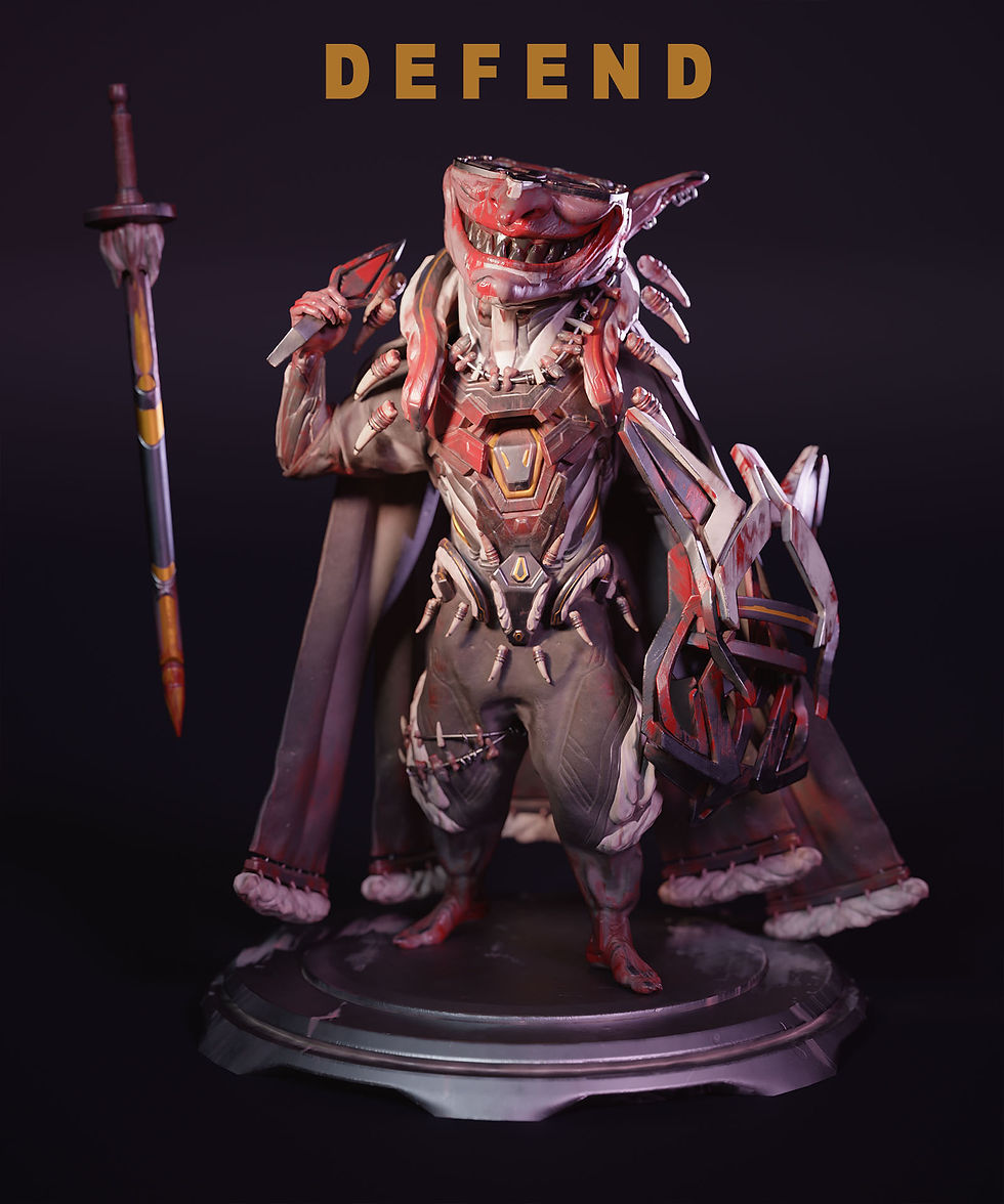
Now that we have the bases for our materials, lets start to tell a story with some added details. For this sculpt i know that the Tokoloshe is a malevolent creature, quite evil, controlled, unrelenting etc.
To show all of this ive chosen to scatter some blood around the hands, feet, face and chest. The blood folders has: dried brown and red blood + fresh Red blood to show that this creature has killed a few times before and just slaughtered something recently. The metal has scratches and the skin on the arms and face are seared and scarred from battles and modification. All this tells a story and solidifies what we want to tell the audience...

Lighting and posing
Yet another factor that will add to the storytelling, lighting and posing is often overlooked as its one of the last steps in this process... but just like any good artist, we will have to pay just as much attention to this step as any other!
Posing:
So lets start here as this is severely overlooked as well; people just set up some sort of "cool" pose without taking things like story, balance, composition etc. into consideration.
We already know about story so lets skip to balance/ composition. Balance, for this anyway, refers to both the physical balancing of the character as well as the compositional balancing of the pose... A lot of poses have the character falling over without anything to catch them (This is the physical part) the other thing they do is people dont exaggerate or push the pose to create something with better compo/ balance of parts to create excitement/ intrigue....
A quick and easy way of balancing the pose, physically, will be to keep track of the heads position and placing the leg that takes the weight directly below it to keep the balance or to place the legs on either side of the head for a really stable look... BTW, this applies to characters that are standing still NOT characters that are moving; anything in motion will look off balance when seen from a single frame!

Finding a Pose thats right for you!
So how did i find a pose? Well firstly, just like with anything else, i will look for refs that match what im going for: malicious, dangerous, evil etc. I found a few poses from Hue Teo (Another amazing artist whose content you should also checkout; after my stuff, of course...). After finding something that seemed "cool" I started posing the retopo'd character in zbrush accordingly..
Although, after posing the character in an action pose, it just didnt sit right with me... So, instead, I used my mental library of poses; yes i actually posed myself into the next pose and then posed the character according to what i felt (the weight, tilt, twists etc of my body!) after which, i then adjusted the pose to exaggerate and enforce the pose i was going for. This was yet another attempt that i just wasnt feeling and so i tried another pose from memory that i thought might suit him and BINGO! Now obviously this pose is not unique and im pretty sure if youve watched any character with a sword pose, youve seen this pose. BUT! It really suited my character! So i went with it, adjusting as necessary...

You can immediately see that the last two poses on the bottom right (and top right) tell a far better story for our character than the first two. The bottom right two tell of something thats dangerous, cunning, confident etc. The first one is just kinda "Ehh?"...

Oh, also, the last pose (On the right from the above picture) is actually from a reference picture which i really liked from Mikalai Dzemiantsevich of swame studios! Thanks Mik! But being me i couldnt help but change it a little!
Lighting
Pretty much the last part here. Lighting, like playing next to an all-star athlete, is yet another part of the process that is overlooked! But, just like with anything we've discussed, it should be used to tell and support a story (or the all-star athlete!), Okay im done with that analogy...
Lighting is so powerful that if you took a ps3 era asset and put it into a modern PC title with just better lighting and nothing more it would actually look 10x better!
As for light composition; you cant just plop a bunch of lights onto the scene and expect magic! It just doesn't work that way! A different camera position requires different lighting so of course a different scene will require another setup! ALWAYS REMEMBER THIS!!! It isnt a hard rule, though so dont crack your skull over changing the lighting everytime you adjust the character's position a little...
Keep it simple!
As it says, lighting setups need to be simple. Main Lights are like kids; if you have over 3 - 5 main lights - its too much! By main lights i mean the ones that are bright enough to significantly light the character. Sub lights on the other hand are used to light individual objects like a book the character might be holding...
So how do we actually keep it simple? Well first, lets just go through the simple, effective, usual setups to help you understand basic lights and terms!
Main (Key) light:
This is the main light that will provide the (usually) brightest light lighting the main part of what you intend to light.
Secondary (fill) Light:
This is a wingman, basically, to the main light. It will sit opposite or, usually, adjacent to the main light to fill in any shadows the main light isnt getting to. The brighter this light is the more high key (high key = Lighter - low key means darker) the whole scene will be. So if you are going for a scarier scene this light wont be doing too much heavy lifting...
Rim Light:
These lights can be quite important as they will highlight the edges of the shadow side (usually the side with the secondary light) to make the forms pop. Its usually placed behind the model/ subject to achieve a halo/ rim like effect.
Now to clarify all this lets have a look at the epic setups provided by digitalcameraworld.com so you can actually see the lights in action!

From these you can clearly see different setups that say something about the model; more light = good guy feelings, less light = bad guy or danger or mystery etc etc. Each setup should be treated as something that, again, TELLS A STORY!!
Just as an FYI, this setup is a general guide, you are more than welcome to move, shift, add and even block these lighting setups to achieve a better story etc.
Speaking of blocking; light blocks are used to do just that, block a light in ways to better suit the character or composition. The best example of a light block would be a repeating set of shadows falling on a mysterious character... This is rather advanced so im not going to go any further with it!

Lighting: adding colour
Lights are great for creating a specific mood. But it can get pretty boring if youre just using the same white(ish) colour lighting all the time! So to offset this we use colour in our lights to push the story further.
Im not going to go too much in depth here but all you need to know is that using bluish lights mixed with warmish lights on the other side will create some pretty cool effects or just warm colours can be quite comforting or just cool colours can be rather sterile while saturated purples and greens can be very cyberpunk/ neo city...
This is yet another step that requires quite a bit of thought and planning which will certainly push your characters/ scenes beyond what they could be, so dont leave it at something default...


Aaand, hey, thats pretty much it for this article! If you have any questions or want to learn more leave a comment or checkout the rest of site/ my youtube for free and paid tutorials!
Video Process:
Here are the videos if you prefer less reading!!
Hey, it's me again!

Thivolan Moodley, Artist from Johannesburg, SA. Currently working as a freelance character artist. Also creating free and paid tutorials for the clueless- i mean enthusiastic (yeah that sounds better) artists out there!
Tutorials, socials and portfolio: https://linktr.ee/Thivolan3d


Comments